 |
| The Visitor #6 Cover B by Alan Quah |
Simon Bowland's lettering is all about simplicity. His art is so subtle that you barely notice it. Yet that staid veneer hides a symphony of meaning in The Visitor #6.
Writers have been using an asterisk to add a footnote in a narrative box for decades. Yet that asterisk is usually black, or the same color as the text. Here, Simon Bowland replaces the normal black asterisk for a red one, which links you to the narrative box informing you that Kubo-sama is speaking in Japanese.
The Japanese flag, remember, is a red circle on a white field.
When The Visitor walks in on Kubo-sama and Talia Dauber, she warns him that she is under Kubo-sama's control. She has to work hard to fight him off his mental powers. Her warning of "Careful," in bold and a larger font, reveal just how hard she's working to prevent him from using her like a doll.
Or should that be an action figure?
Kubo-sama, on the other hand, is more practiced in controlling others. So his order to Talia of "Kill him," while bold, isn't noticeably larger.
Whereas Talia's warning seems more like a shout, Kubo-sama is just raising his (mental) voice a little, and concentrating on his intonation.
The way Simon Bowland does the sound effects here seems rather artful. They gently curve around Talia in a visually pleasing way, despite doing so asymmetrically. Like I said: subtle.
And then there is the electrical sound effect, and the now familiar yellow-and-blue narrative box to reveal The Visitor's thoughts. Simple, cool, and effective.
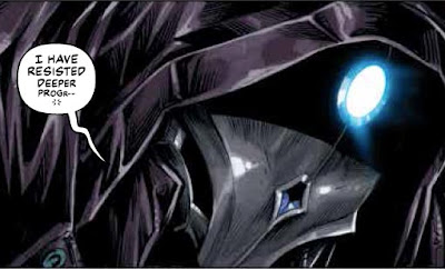
Can The Visitor resist Talia's unwilling attack, as well as Kubo-sama's power? This next panel, with the way his words dwindle and then fade, makes us wonder.
Great job on The Visitor #6, Simon Bowland. Way to draw attention to your art, by not drawing attention to your lettering.
Dragon Dave


No comments:
Post a Comment