Showing posts with label Michael Walsh. Show all posts

Sunday, December 26, 2021

X-O Manowar #4 Covers Part 2


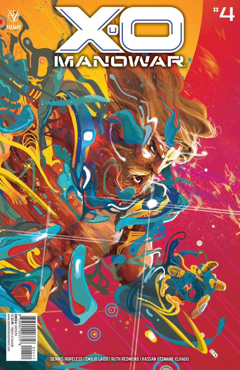
X-O Manowar #4 Sword of Shanhara Cover by Michael Walsh


Jules Verne's 1865 novel From the Earth to the Moon, Georges Melies' 1902 movie "A Trip to the Moon," and Belgian cartoonist Herge's 1953 stories about the intrepid reporter Tin Tin in Destination Moon and Explorers on the Moon, give us just a small taste of how long mankind has yearned to visit Earth's closest neighbor. One of the most beloved of the photographs taken by the Apollo astronauts shows the Earth rising above the surface of the moon. Canadian artist Michael Walsh taps into our eternal fascination--the link between our planet and its moon--in his Sword of Shanhara cover for X-O Manowar #4.

I love the purple sheen he gives to the cover, the way he incorporates Earth into the title, and the flaming sword Aric holds. Is Aric hovering above the moon, or merely taking a giant leap in the one-sixth Earth gravity? Either way, I love the way Aric is gazing upon Earth. Even with his back to us, something about his body language suggests a real love for his homeworld, and a longing to return.

These Sword of Shanhara covers were a really nice way for Valiant to celebrate the return of X-O Manowar to comic book shops. They were retailer incentive covers though, so there's fewer of them out there. Still, this one would make a fine addition to your collection, wouldn't it?


X-O Manowar #4 Pre-Order Cover by Jim Towe & Nick Filardi

I fing the way Aric rushes headlong toward us in Jim Towe's cover quite intriguing. The way Aric is hurtling along, you would thing he'd be flying. Yet he seems to be running, his feet digging into the concrete, his face only a couple feet off the pavement. 

The background intrigues as well. Notice the crazy angle at which the buildings are tilted. And what about the flaming car with its passenger-side wheels off the ground? Or how about the car immediately behind Aric, which looks as if its front end is almost touching the pavement?

Does the white on the ground before and to either side of Aric suggest snow? Do the white-out conditions behind Aric suggest a blizzard. Or is that the backwash of air displaced by Aric's Shanhara-enhanced running? North Carolina colorist Nick Filardi may live a world away from Michigan-based penciler and inker Jim Towe, yet they've joined forces remotely to create an incredibly intriguing cover. 

While neither cover seems to directly relate to Aric's battle with the Ukrainian warlord Yakiov in X-O Manowar #4, both suggest their own stories. Perhaps Valiant Comics should commission Michael Walsh, Jim Towe, and Nick Filardi to write one-shot issues about the events behind these covers. I'd be interested in reading them, wouldn't you?

Dragon Dave

Friday, August 27, 2021

Ninjak #2 Spotlight: Penciling & Inking


Ninjak #2 Cover B by Michael Walsh


Ninjak #2 begins with a train wreck. Perhaps this occurs in England. It might also take place somewhere in Europe, after Ninjak and Myna leave Amsterdam. 

All we know is what we see. Electrical lines stretch across the sky. Lampposts light the rails' path. Trees grow nearby, but the ground looks dry, barren.

In the background, people are not just leaving the wreck, but fleeing it. The train cars snake diagonally atop and alongside the rails. Smoke still rises from the car Myna and Ninjak have climbed from.

Myna seems fixated on the interior of the wrecked train car.


Overhead, the flying bounty hunter gazes down. Penciler and Inker Javier Pulido shows her hovering. We know she's not flying fast, as her hair hangs down.


Ninjak doesn't know Myna well. But for a second time, he puts his hand on her shoulder.

Myna looks at it, wondering what it means.


You often see gargoyles in England. They cling to buildings, and ward off evil from churches. Having grown up in England, this bounty hunter might well be the stuff of nightmares for Colin King, aka Ninjak.

As Colin looks up at him, and the gargoyle-like creature attacks, the foreground sees to distort before his eyes.


Ninjak seems to have gone back to basics in this series. In Ninjak #2, his attire reflects the years he spent immersed in Japanese history and culture.


Remember the silhouette of the gargoyle-like bounty hunter in an earlier post? Remember the silhouette of Ninjak and Myna leaping from the train earlier in this one? Javier Pulido certainly seems to enjoy inking in characters in moments of crisis.


When we get a close-up of the immensely-strong bounty hunter, we can see more of his metal face. The way the shadows fall reveals the carved appearance of his features.


Sensing nearby movement, the gargoyle's head whips round. Spittle arcs from his mouth, splashes against his cheek.


Does he even notice the shadow of the train car that darkens the ground around him?


In Ninjak #2, penciler and inker Javier Pulido reveals Ninjak's training and heritage, shows how Colin may be warming to Myna, and utilizes different techniques to build the intensity of a particularly deathly battle. 

Dragon Dave

Tuesday, August 24, 2021

Ninjak #2 Spolight: Lettering


Ninjak #2 Cover B by Michael Walsh


Before I get on with this focus on the lettering in Ninjak #2, I find myself arrested by this spectacular cover by Michael Walsh. In minimizing the colors, he signals an affinity with interior artist Javier Pulido's work. I love the castle in the background, and the fighting stars flying toward me. As in Cover A, the X in the background reminds me that Ninjak seems to have a target placed on his back, and everyone's out to get him. 

Of course, once you open the issue, you realize that part of the action takes place in Scotland. The Scottish flag, you may remember, is a white X on a blue background. So just as interior artist Javier Pulido combines different concepts in each panel, Michael Walsh has also built many layers of storytelling into this very interesting cover.

As with Cover A by David Nakayama, the limited color usage, and the stars flying toward me, make me wonder if Walsh's intention was not just to suggest a 3D effect, but actually to create one. I guess I really need to take my red-and-blue glasses with me to the comics shop this week, don't I?


Now onto the lettering. Here we see a crackly sound effect running vertically down the middle of the panel, separating Myna and Ninjak from the bounty hunter. We also notice Javier Pulido's use of italics, bold lettering, and even an entirely different font in the dialogue balloons. Of course, there's also a stylized letter G placed like a belt buckle on the bounty hunter. 

Whether you want to count the latter as lettering, or costume design--or both--I leave to you.


To the left we see more of that crackling sound effect. It's placement below the flying bounty hunter, and the letters' size, suggests the sound and intensity of the energy she's hurling down.

To the right, we see the story title. Pulido has bitten into the title with the first letters of the creators and editor's last name. He also spells out Ninjak in the upper portion of the letter T in Daylight. Meanwhile, our hero pushes up from below, standing before the title Part 2, and holds his sword aloft. 

His sword serves as the vertical portion of the letter T.


The bounty hunter growls in purple capital letters, as if to remind readers of the purple in Ninjak's combat suit. The wavy arrow from him to the dialogue balloon mimics the wavy purple capital letters of his growl.


The incredibly strong, metal-skinned bounty hunter also wears a G on his outfight. The capital letters from when he lifts up this wrecked train car remind us of the creaks and groans the wreckage makes, now that it's lost its structural integrity. This bounty hunter's dialogue balloons are reminiscent of puffy clouds. 

Or have metal rats nibbled the edges?

Hm. Perhaps, on reflection, they represent gears?


In any case, when he slams the train car down and hurls it forward, the big and blocky sound effect overwhelms the background.


When the flying bounty hunter hurls a stream of hail, the sharp edges of Ninjak's dialogue balloon suggest he's been rather, ahem, chilled.


This last panel, with the sound effect arising from the ball of energy surrounding the flying bounty hunter's hand, seems reminiscent of the Daylight Part 2 title panel. 

With his signature flair for lettering, Javier Pulido's lettering and sound effects truly inhabit their panels. They crackle and boom, filling Ninjak #2 with their unique style and energy. Can you feel them?

Dragon Dave

Tuesday, July 27, 2021

Shadowman #4 Spotlight: Lettering


Shadowman #4 Cover B by Michael Walsh*


In Shadowman #4, letter Clayton Cowles demonstrates his usual understated brilliance.


Shadowman's words, at least when he appears in his Human form of Jack Boniface, are set in a normal font that is pleasing to the eye. When he stresses words in a sentence, the words come in bold and italicized. Again, nothing that makes your eyes (tired no doubt from reading through your pile of new weekly comics) work overtime.


By contrast, Baron Samedi's ornate font is as flamboyant as his dress sense. Would you categorize it as Gothic, Victorian, or Italianate? Either way, the font communicates a sense of history. 


Once Jack lapses into monologue-ing mode, Clayton Cowles shares Jack's thoughts with us as gently rounded narrative boxes. While the white font can be a little harder to read, I like how the black background reveals the loa inside him.


This sound effect is a lot of fun, and so effective too. We don't really need to see Jack glance up to know what he's hearing, or the direction the sound is traveling.


This character, whom you'll see more of the pages preceding the preview pages the good folks at Valiant Comics were kind enough to share with us, reveals his unbalanced nature by the style of his font. I like how the balloon background reflects his skin coloring. 

Do the two SS's together suggest that the character is hissing like a snake? Maybe just a little?


One thing I always struggled to understand was the significance of Hassan Otsmane-Elhaou's colored font and sound effects in Max Bemis and Nathan Stockman's recent Savage series. Thankfully, Clayton Cowles' sound effects seem consistent from issue to issue. For example, consider the style, size, and coloring of these sound effects when you compare Shadowman swinging his scythe at an opponent in Shadowman #4 with the first issue.


From Shadowman #1

Such consistency helps unite these issues released months apart. Given the grotesque imagery involved in such moments, that's another source of comfort letterer Clayton Cowles affords readers in this fantastic horror series.

Dragon Dave

* No wonder Shadowman has a headache in artist Jon Davis-Hunt's cover. Somebody get Shadowman that aspirin, and hurry!

Saturday, March 13, 2021

Savage #2: All The Covers & Why You Need Them


Savage #2 Cover A by Marcus To


Cover A for Savage #2 looks wild, doesn't it? These guys Kevin Sauvage (aka Savage) is fighting remind me of Deinosuchus, the prehistoric "terrible crocodile," and the ancestors of our modern alligators and crocodiles. More important, it reminds me of how Aric of Dacia fought dinosaurs in the pit arena in the 1990s X-O Manowar series (as part of the Unity crossover). Old School Conan the Barbarian fans may also remember a Roy Thomas written story, in those early Marvel Comics issues, in which Conan fights off an army with only the chain to which he was once manacled. 

Well done, Marcus To!


Savage #2 Cover B by Michael Walsh

Cover B is another mock advertisement, akin to the Retailer Incentive cover for Savage #1 by artist Stacey Lee. This time, instead of hawking shampoo and conditioner, Kevin Savage is the poster child for cologne named after him. At the same time, it also pairs nicely with Savage #1 Cover B by Christian Ward, which I call the Social Media cover. Best of all, retailers won't have to purchase a certain number of issues to get this cover, so if you missed out on the Savage #1 Stacey Lee Cover, you should easily snag this beauty. 

Beautiful job, Michael Walsh!


Savage #2 Pre-order Cover by David Lopez


Whoa! This Pre-order cover is hot stuff! If you picked up the Savage #1 Pre-order cover, you'll know there was an encyclopedia entry on the dinosaur on the cover. I can't wait to pick up my copy of this beauty. Hopefully, they'll be another entry on this guy. I love learning about new dinosaurs!

Most intriguing, David Lopez!

If you haven't ordered your copy of Savage #2, head down to your comic shop first thing Wednesday, March 17, so you can secure your favorite cover, if not all three!

Dragon Deinosuchus Dave

Saturday, January 23, 2021

X-O Manowar #4 Review: Yakiov In America

Cover A by Christian Ward


In X-O Manowar #4, writer Dennis Hallum shows us the instability of the dictator. Or at least, a would-be dictator. Having seemingly won in his insurgency movement, and secured his hold on the Ukraine, warlord Vlad Yakiov headed to the U.S., where he captured the mother and child who had taken Aric in. While it seems strange that a foreign military band could carry out such a move in downtown New York City, recent events in our nation's capitol remind us that nothing is impossible.

Here's the preview pages for X-O Manowar #4:


Unlike his adventures in the Ukraine, in which X-O Manowar battled one of Troy Whitaker's robots, and then took on Yakiov's forces single-handed, this time the full resources of Whitaker's technological empire are on Aric's side. As you can see, the resultant battle is spectacular.

Cover B by Paul Renaud


 Another development in the last issue was a radical change to Aric's armor. Whitaker found a way to increase the power of Shanhara, which again seems strange, given that the armor is a driven by a sentient alien, and even the extraterrestrial race The Vine never found a means of controlling it. But Troy Whitaker is a billionaire industrialist, and the ruler of a technological empire. If anyone on Earth can hack Shanhara, it makes sense it would be him.

Cover C by Kael Ngu

By far the biggest surprise from last issue was a strange nanite swarm that attacked, and nearly got the better of Aric. Did it come from the newly refunded Project Rising Spirit? Does it have something to do with all the nanites The Burned bled out of Bloodshot? Or does this storm, either remotely controlled or operating a gestalt entity, have origins we can only begin to imagine? While X-O Manowar #4 may not answer those questions, rest assured that this nanite swarm was in no way an isolated, one-time event.


Sword of Shanhara Incentive Cover by Michael Walsh


In these last four issues, writer Dennis "Hopeless" Hallum has given us a plethora of storylines, and introduced us to characters we want to see more of. While we may have to wait a few months until the next issue arrives, I suspect the wait will be well worth it.


Pre-Order Cover by Jim Towe

In the meantime, I plan on reading through all four issues a couple more times, searching each issue for clues, and enjoying the beautiful artwork by penciler Emilio Laiso and colorist Ruth Redmond. I invite you to accompany me on this journey into this new series of X-O Manowar, overseen by Senior Editor Heather Antos. That is, if you dare. 

Dragon Dave