 |
| The Visitor #5 Cover B by Caspar Wijngaard |
In The Visitor #5, Paul Levitz writes in largely visual terms. This leaves Simon Bowland with less lettering to do than in more recent series like Savage and Shadowman. Still, Simon enhances the story with expressive and emotive lettering.
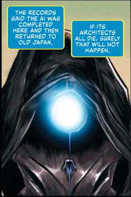
Simon shares The Visitor's thoughts with us through blue narrative boxes outlined with yellow, and white lettering. While the character's past--at least in the beginning of the issue--are unknown to us, these narrative boxes give us insight into how he perceives the world, as well as what's important to him.
I particularly like this scene when a woman, wrapped up in her spiel, catches a glimpse of The Visitor. With a spiky balloon and red lettering, Simon shares her shock at turning around, and seeing this strangely clad figure falling past. Whether or not she's aware of the security threat to her company, seeing someone fall off a multistory building is guaranteed to frighten anyone.
As she no doubt realizes a second later, the figure is sliding down via a cable. He's unlikely to die from his fall. So we can smile, even while we know how much it would throw us for a loop if the same thing happened to us.
In fact, The Visitor does fall and hit the ground. At least, he does at one point in the story. When he does, Simon Bowland shows us the impact he sustains with a sound effect that pairs well with the motion penciler and inker Soo Lee tries to capture.
You may recall that The Visitor has the ability to interface with circuitry. The blue lettering of this sound effect--outlined in white--combines well with the way Ulises Arreola's colors the sparking electricity.
I hope The Visitor doesn't get electrocuted!
When people shoot at The Visitor, Simon Bowland relates the sound of the bullets' impacts with simple white block lettering. They help us realize that, while bullets would stop you or me, they probably won't stop The Visitor.
Also, consider how the BLAMs are smaller than the WHAMMM when The Visitor falls. This suggests that, while The Visitor was hurt in neither scene, perhaps the first one bothered him more due to its unexpected nature.
Perhaps, for a moment, the impact of his fall shocked him as much as seeing him fall shocked the woman.
Simon Bowland's most inspired work on The Visitor #5 could be the way he relates the title character's thoughts to us. These tri-colored narrative boxes merge well with his appearance.
As they relate his inmost thoughts, Simon Bowland's blue, yellow and white narrative boxes make The Visitor seem more approachable. They help us feel--and care--for him. That's a welcome contribution when dealing with a mysterious figure like The Visitor.
Dragon Dave


No comments:
Post a Comment