Showing posts with label Nathan Stockman. Show all posts

Tuesday, July 27, 2021

Shadowman #4 Spotlight: Lettering


Shadowman #4 Cover B by Michael Walsh*


In Shadowman #4, letter Clayton Cowles demonstrates his usual understated brilliance.


Shadowman's words, at least when he appears in his Human form of Jack Boniface, are set in a normal font that is pleasing to the eye. When he stresses words in a sentence, the words come in bold and italicized. Again, nothing that makes your eyes (tired no doubt from reading through your pile of new weekly comics) work overtime.


By contrast, Baron Samedi's ornate font is as flamboyant as his dress sense. Would you categorize it as Gothic, Victorian, or Italianate? Either way, the font communicates a sense of history. 


Once Jack lapses into monologue-ing mode, Clayton Cowles shares Jack's thoughts with us as gently rounded narrative boxes. While the white font can be a little harder to read, I like how the black background reveals the loa inside him.


This sound effect is a lot of fun, and so effective too. We don't really need to see Jack glance up to know what he's hearing, or the direction the sound is traveling.


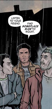
This character, whom you'll see more of the pages preceding the preview pages the good folks at Valiant Comics were kind enough to share with us, reveals his unbalanced nature by the style of his font. I like how the balloon background reflects his skin coloring. 

Do the two SS's together suggest that the character is hissing like a snake? Maybe just a little?


One thing I always struggled to understand was the significance of Hassan Otsmane-Elhaou's colored font and sound effects in Max Bemis and Nathan Stockman's recent Savage series. Thankfully, Clayton Cowles' sound effects seem consistent from issue to issue. For example, consider the style, size, and coloring of these sound effects when you compare Shadowman swinging his scythe at an opponent in Shadowman #4 with the first issue.


From Shadowman #1

Such consistency helps unite these issues released months apart. Given the grotesque imagery involved in such moments, that's another source of comfort letterer Clayton Cowles affords readers in this fantastic horror series.

Dragon Dave

* No wonder Shadowman has a headache in artist Jon Davis-Hunt's cover. Somebody get Shadowman that aspirin, and hurry!

Monday, May 17, 2021

A Savage Shadowbox


I made this to celebrate Valiant's new Savage series. It may not have been the series I had hoped for. Nevertheless, I found depth and value in those four story-packed issues. 

Sadly, this Savage series has ended. Still, I can look at this display and remember all those fun moments. Congratulations again to departing editor Heather Antos, writer Max Bemis, penciler and inker Nathan Stockman, colorist Triona Farrell, and letterer Hassan Otsmane-Elhaou.

Now to find a place to hang my Savage shadowbox.


Thanks again, Valiant Comics, for my Savage bone pen and title pin.

Dragon Dave

Friday, May 14, 2021

Savage #4 Review: Penciling & Inking


Savage #4 Cover A by Marcus To & Rico Renzi


In this final issue of Savage, penciler and inker Nathan Stockman takes us inside the mind of Henry Sauvage, the older brother of the young and popular Kevin Sauvage, aka Savage. Here we see Henry standing in the doorway of Kevin's room, crossing his arms over his chest and frowning. You can almost here him saying "Why does he get all the attention?" 

The green dinosaur toy on the shelf is a nice touch.


Henry believes he faked his childhood emotions well. The next panel suggests that even his beloved nanny didn't buy his gamesmanship. He clings to her, but she holds onto his forearms, preventing a real hug.  


Notice the pineapple icon on Henry's phone? Traditionally, the pineapple has been used to symbolize friendship, hospitality, prosperity, and diplomacy. Recently, it's been used on social media to signal a complicated relationship status. 

Yes, I imagine a relationship with Henry would be complicated.


Henry Sauvage may not be as particular as Hercule Poirot, but he seems like someone who wants everything in just the right place. Certainly his apartment suggests that. The symmetry in this next three-panel-scene seems like something he would approve of.

The way the fire is burning around him in the background underlines his mood.


Enough about Henry. See how these dinosaurs are hovering over this poor little sheep? Imagine how scared the poor little sheep--mostly inked in--would be!

And speaking of inking, who's that I see in the background? Could it be Kevin Sauvage, aka Savage, leaping in to save this poor little defenseless sheep?


Henry and Kevin both feel as if the world doesn't value them for who they are. But while Henry's feelings of rejection have led him to destruction, Kevin still insists on being its protector. 


I'm guessing this family are grateful to Kevin for saving their lives, their animals, and their farm. Even the dog likes Kevin. And dogs don't care about things like billboard advertisements, magazine covers, or social media.

Great job, Nathan Stockman! Your penciling & inking have enhanced every issue of this series of Savage!

Dragon Dave

Wednesday, May 12, 2021

Savage #4 Review: Lettering


Savage #4 Cover B by Paulina Ganucheau


Letterer Hassan Otsmane-Elhaou kicks off this final issue of Savage in rather sedate form. He relates Henry Sauvage's soliloquy about his upbringing without much deviation in textual style. But when Savage #4 returns to the present, Hassan immediately signals this with one of his familiar yellow paper scrap narrative boxes.


I wish I could show the next panel bigger. Still, you can see three things: how tiny the print is from the social media messages on Henry's phone, how he speaks in normal size and style font when he talks of himself, and how the words suddenly go bold when he talks about everyone else.

Kevin's older brother clearly has a chip on his shoulder. He feels the world has rejected him again and again. Hassan signals this three ways: 1) Everyone else is tiny and therefore insignificant, 2) he is normal, and 3) those who embraced his younger brother warmly--while rejecting him--can die for all he cares.


Penciler Nathan Stockman tends to render Project Bizarre's paleolithic recreations somewhat shakily, as if to suggest they don't belong in our world. Hassan echoes Nathan's style in the way he writes the dinosaurs' dialogue.


Or perhaps Hassan is signalling that these weird dinos are as mad as Professor Nealon, the director of Project Bizarre. After all, it's often the truly insane who offer the most astute social commentary.


Either way, Kevin makes his position clear. He has no problem with Britain's bovine population. But when it comes to these wacky dinosaurs, he's making sure that they Rest In Peace

Or perhaps a better translation of Hassan's sound effect would be: Rest In Insanely Intolerably Intense Peace?


Thanks for enhancing Savage #4, and this entire series, with your excellent lettering talents, Hassan Otsmane-Elhaou!

Dragon Dave

Tuesday, May 11, 2021

Savage #4 Preview Pages


Savage #4 Cover A by Marcus To & Rico Renzi


After three pulse-pounding issues, the final issue of Savage arrives tomorrow. This series has blown-open our conceptions of what a Savage series can and should be about. If you love the way Max Bemis, Nathan Stockman, Triona Farrell, Hassan Otsmane-Elhaou, and departing editor Heather Antos have expanded the Savage franchise, you won't be disappointed with this final installment.

Without further ado, here's your moment of Savage zen.


The turmoil. The angst. The talking dinosaurs who take up farming? Trust me: you haven't seen anything yet. 

I enjoyed discovering how the creative team sewed all the plotlines together in this final issue, and am looking forward to sharing my thoughts with you. Make sure you hit your local comic shop tomorrow: you won't want to miss out on this final--and extremely Savage--issue!

Dragon Dave

Tuesday, April 20, 2021

Savage #3 Review: Penciling & Inking Part 2

Savage #3 Cover B by Joe Quinones


Here's some final thoughts on Nathan Stockman's penciling and inking in Savage #3.


Firstly, I like how Nathan, as an artist, generally gets the perspective right. In the above panel, Kevin looks small in the background, but not disproportionately so compared to his chief butler Al. It's easy for an artist to make a character in the foreground look like a giant compared to those in the distance. This recently happened in a comic by an artist whose work I've long admired, and it threw me out of the story. 


Secondly, I really like this lightbulb moment. Kevin's clearly been struck by inspiration. No background needed!


Thirdly, here's a reminder of what Kevin's left behind. We glimpse his older brother Henry in his posh London flat. It looks similar to Kevin's. Or was Kevin living in Henry's apartment? More on that in my Savage #3 story review.


Lastly, here's a tiny panel from beyond the preview pages in Savage #3. For those of you who may not have picked up your copy of Savage #3, I don't want to throw out too many spoilers. So I'll just hint that the purple-tentacled creature that attacks Kevin isn't the only monster we'll see in this issue. Project Bizarre has clearly been busy, as has Nathan Stockman. But then, what would you expect of an artist who draws cities, monsters, tropical islands, and people equally well?

Dragon Dave

Monday, April 19, 2021

Savage #3 Review: Penciling & Inking Part 1


Savage #3 Cover A by Marcus To & Rico Renzi*


Without penciling and inking, you'd just have a script, not a comic. As visual people, we respond to pictures far more than words. In an artist's hands, one picture can transport us to another place, another time, and make even the most bizarre people and monsters seem real.


I know I used this panel before, in my lettering post, but I wanted to use it again because I love it so much. Despite Hassan Otsmane-Elhaou's great skills, I wish I could see this picture without the narrative boxes. Triona Farrell's coloring really brings out all of Nathan Stockman's artwork here. Nonetheless, it's Nathan's skills that show Kevin swinging through the trees like Tarzan. It's clear Kev's having the time of his life. 

While Triona's coloring helps us see the distance better, Nathan drew all the background first. I'm also intrigued by how Nathan inked parts of the water, instead of leaving Triona to color those areas more darkly. In any case, that inked water helps bring Kevin to the forefront.


When visiting the Big Island of Hawaii, I'll often see a vehicle parked off the side of the road. Just in the middle of nowhere. From talking with the locals, I suspect many of those belong to guys who have gone out to hunt wild pigs.

Here Kevin's going after the wild pigs on his own tropical paradise. I love how Nathan Stockman captures all the crazy, confused action that must go on in a fight like this. Unlike those Hawaiian hunters, Kevin's not shooting an animal from the distance. Armed solely with his dinosaur-claw knives, he risks getting gored, if not killed. 

In this small panel, Nathan helps me feel the exhilaration of the hunt.


I recently enjoyed Kim Stanley Robinson's novel Green Earth. It's an edited compilation of an earlier trilogy: Forty Signs of Rain, Fifty Degrees Below, and Sixty Days and Counting. In Robinson's story, Frank is a scientist working at the National Science Foundation in Washington, D.C. After a massive flood ruins many apartment buildings in the area, he has trouble finding affordable housing. Inspired by dreams of his youth, he builds a rudimentary treehouse in a closed-off section of a wilderness park. There, he finds himself at home amid nature, and at peace within himself.

In case my description of Robinson's novel intrigues you, I don't want to give away too many spoilers. Still, I'll give you another tease. Later in Green Earth, Frank uses his experience in treehouse-building to help design a treehouse complex worthy of the Ewok tribe in the Star Wars movie "Return of the Jedi." 

Okay, back to Savage #3.


I love all the little homey touches Nathan has built into Kevin's treehouse: his weapons, his trophies, and of course, the boar he's killed. There's a picture of (I believe) the emoji he's created which has made him lots of money. I also find myself wondering about the crest on the banner. Is it from the British football team (Soccer to us) his dad used to play for? Or is it the family crest that adorned a cover from Valiant's earlier Savage series?

As the issue goes on, solitude may get Kevin down. Still, due to Nathan Stockman's efforts, I can't help but wonder if Kevin doesn't love this treehouse more than his posh, expensive London flat.

Dragon Dave

*Although I didn't credit his work earlier, Rico Renzi colored Marcus To's drawing for Savage #3 Cover A. If you're interested in him, his methods, and his earlier work, here's an interview you might enjoy.

Colorist On Color: Rico Renzi

Friday, April 16, 2021

Savage #3 Review: Coloring

Savage #3 Pre-Order Cover by Paco Diaz


From working with my Prismacolor pencils, I know how much work goes into getting the colors the richness and depth I want. It seems as though I spend far more time coloring than I do drawing. Perhaps it's different when coloring on a computer. I don't know. Nonetheless, my sketching experience helps me appreciate the colorist's contributions to comics more.


Consider the page above. At first you might think there's just Nathan Stockman's penciling and inking, with a little colors and shading splashed on. But it was colorist Triona Farrell's job to make those shadows look real. Getting the light sources right is an important consideration. If she hadn't worked so hard on these, the scene just wouldn't seem real and three-dimensional.

I especially love how all those shadows cast by the unseen palm branches enhance this scene.


Writer Max Bemis conveys a lot of backstory on page two. Penciler and Inker Nathan Stockman met that challenge by composing (for the most part) six old-school style panels. What strikes me as I look at the page is how Triona Farrell colored each panel so differently. 

In the above panel, Triona colors the sky around the roaring fire orange, and adds light to the surrounding foliage. This washes out the greens a little, like overexposing a photo. 


Here we see Kevin practicing his Parkour moves along the rim of a volcano. While the volcano isn't erupting, we can see that it is active. Notice the lava reflecting off the interior, and the steam rising from the center. 

Without Triona's coloring, I wouldn't notice that the volcano was active. Nor would I worry about Kevin's health from inhaling all those toxic fumes.


Awhile back, I recreated the Pre-Order cover for Incursion #2 using scrapbook papers, colored pencils, and pens. In the end, I was reasonably happy with my interpretation of the Eternal Warrior. But it looked nowhere near as good as artist Tonci Zinjic's original artwork.

Even though I found the right color paper for Gilad's skin, getting all the shading that covers part of his face proved tough. There were colors within the shading, and areas that were more deeply shaded. When looking at the above panel, I'm struck by how Triona's coloring makes Kevin's face look far more real than my own poor efforts with Gilad.


Page four mirrors page two thematically, with six even-more-old-school style panels. Each for the most part replicates the scenes on the earlier page. But these come after his attempt to befriend his butler. Whereas on page two Kevin looked jubilant, on page four he looks bored. Thus, the panel here, when compared with its page two counterpart, looks darker to emphasize his mood. 

The area around the fire isn't overexposed at all.


This scene looks even darker, but the time of day tells you that it's nowhere near nightfall. The way Triona adds color to the crater walls reveals that we're looking up at Kevin from inside the hot caldera. Thus, being so close to the intense light from the lava, the sky looks dark by comparison. 

Not only does the dark sky give us a better sense of Kevin's mood, but it also goes with the colors of the fifty pound notes.

I wonder if Valiant pays Triona for her coloring in fifty pound notes?


This final scene, showing Kevin's profile and his Mae doll in shadow, reveals just how much the purple tentacle has blocked the light from shining into his tree house. It helps us realize just how big the creature is. No wonder Kevin is surprised. 

Still, language please, Kev. Ladies present!

I really appreciate how much work Triona Farrell put into this issue. Her coloring enhances Savage #3 with the richness and depth Valiant readers demand from their comics. Thank you, Triona!

Dragon Dave

Related Links:

My Eternal Warrior Recreation

Wednesday, April 14, 2021

Savage #3 Preview Pages & Musings on Jack Kirby

Savage #3 Cover A by Marcus To
 

In Savage #1, we had just caught up with young Kevin Sauvage when dinosaurs attacked his new hometown of London, England. These dinosaurs, impossibly large, ravaged everything in sight, including a familiar and historic London landmark.

Savage #2 found our hero beneath the streets of London, where the research facilities of Project Bizarre were located. There Kevin met Professor Hanley Nealon, the head of the nefarious organization, as well as his perky young protege Mae. Then he learned these researchers who grew such monstrous dinosaurs intended to dissect and study him.

What will happen in Savage #3? I guess we'll find out today, when Savage #3 goes on sale. In case you haven't seen them elsewhere, here are some preview pages to tantalize you before you head out to your local comic shop to pick up your copy of Savage #3.


I'll admit it: there's one thing I wonder about. Could the first page be kind of a comics community in-joke about Marvel's character the Black Panther? Could writer Max Bemis be suggesting that Kevin Sauvage is as good as their jungle hero Ka-Zar

Interestingly, Ka-Zar was created by the great Jack Kirby, who also created Devil Dinosaur. Another fun fact: Ka-Zar's real name is Kevin Plunder. So both Marvel and Valiant have two dinosaur-hunting, jungle-loving characters called Kevin!

Now that I think about it, Jack Kirby's Devil Dinosaur series was pretty far out. Just like Max Bemis' Savage, it also juxtaposed a lot of disparate story elements to create an exciting and zany series. I wonder how Nathan Stockman would feel about having his penciling and inking compared with his illustrious predecessor?

Enough musings! Like you, I can't wait to read Savage #3. So I'm going to sign off this post, and dive into the rich, dinosaur-fighting goodness of Savage #3. 

Dragon Dave

P.S. The Black Panther was created by Stan Lee and--you guessed it--Jack Kirby.