 |
| Ninjak #2 Cover B by Michael Walsh |
Before I get on with this focus on the lettering in Ninjak #2, I find myself arrested by this spectacular cover by Michael Walsh. In minimizing the colors, he signals an affinity with interior artist Javier Pulido's work. I love the castle in the background, and the fighting stars flying toward me. As in Cover A, the X in the background reminds me that Ninjak seems to have a target placed on his back, and everyone's out to get him.
Of course, once you open the issue, you realize that part of the action takes place in Scotland. The Scottish flag, you may remember, is a white X on a blue background. So just as interior artist Javier Pulido combines different concepts in each panel, Michael Walsh has also built many layers of storytelling into this very interesting cover.
As with Cover A by David Nakayama, the limited color usage, and the stars flying toward me, make me wonder if Walsh's intention was not just to suggest a 3D effect, but actually to create one. I guess I really need to take my red-and-blue glasses with me to the comics shop this week, don't I?
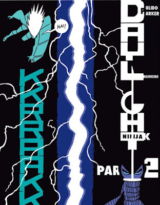
Now onto the lettering. Here we see a crackly sound effect running vertically down the middle of the panel, separating Myna and Ninjak from the bounty hunter. We also notice Javier Pulido's use of italics, bold lettering, and even an entirely different font in the dialogue balloons. Of course, there's also a stylized letter G placed like a belt buckle on the bounty hunter.
Whether you want to count the latter as lettering, or costume design--or both--I leave to you.
To the left we see more of that crackling sound effect. It's placement below the flying bounty hunter, and the letters' size, suggests the sound and intensity of the energy she's hurling down.
To the right, we see the story title. Pulido has bitten into the title with the first letters of the creators and editor's last name. He also spells out Ninjak in the upper portion of the letter T in Daylight. Meanwhile, our hero pushes up from below, standing before the title Part 2, and holds his sword aloft.
His sword serves as the vertical portion of the letter T.
The bounty hunter growls in purple capital letters, as if to remind readers of the purple in Ninjak's combat suit. The wavy arrow from him to the dialogue balloon mimics the wavy purple capital letters of his growl.
The incredibly strong, metal-skinned bounty hunter also wears a G on his outfight. The capital letters from when he lifts up this wrecked train car remind us of the creaks and groans the wreckage makes, now that it's lost its structural integrity. This bounty hunter's dialogue balloons are reminiscent of puffy clouds.
Or have metal rats nibbled the edges?
Hm. Perhaps, on reflection, they represent gears?
In any case, when he slams the train car down and hurls it forward, the big and blocky sound effect overwhelms the background.
When the flying bounty hunter hurls a stream of hail, the sharp edges of Ninjak's dialogue balloon suggest he's been rather, ahem, chilled.
This last panel, with the sound effect arising from the ball of energy surrounding the flying bounty hunter's hand, seems reminiscent of the Daylight Part 2 title panel.
With his signature flair for lettering, Javier Pulido's lettering and sound effects truly inhabit their panels. They crackle and boom, filling Ninjak #2 with their unique style and energy. Can you feel them?
Dragon Dave


No comments:
Post a Comment