Saturday, February 27, 2021

Bloodshot #11 Review: The Writing Of Tim Seeley


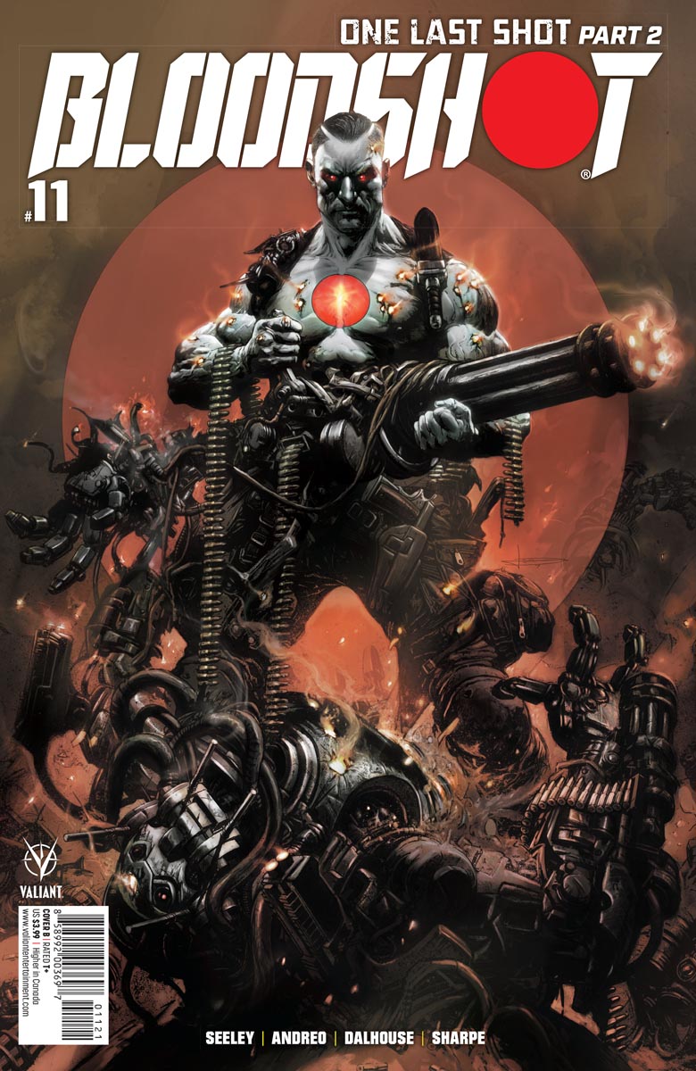
If you've read my previous posts on Bloodshot #11, you've probably gotten tired of reading about how Bloodshot, KT, and Wigans infiltrate the undersea Project Rising Spirit (PRS) facility. You may want to know how their confrontation with Zealot turns out, but I'm not going to tell you. So instead I thought I'd cover the appearance of another character that Bloodshot fans have been looking forward to seeing return.

His name is Rampage, and we last saw him in Bloodshot Salvation #12. 


When Project Omen folded, Rampage lost his nanite-fueled superpowers. But he found a way to get them back. He's also found a new mission, and a powerful benefactor. He's part of the reason that Project Rising Spirit is back. So inevitably, Bloodshot, KT, and Wigans will have to defeat him too if they wish to foil the insidious plans of PRS. But that doesn't mean Bloodshot #11 is all about battles and confrontations.


One thing I've really appreciated about Tim Seeley's writing on this series is the way he deftly blends drama and action. In Bloodshot #11, he finds time for a very human moment between the three friends. He also lightens what could be a very intense discussion with a little gentle humor.

Full disclosure here: Wilfred Wigans is a humor-machine. He's one of those people you want on any team. No matter the circumstances, he always lightens the mood with humor and optimism. I wish I could be more like Tim Seeley's Wigans.


While readying themselves for their mission, Bloodshot reminds them of what their fight is all about. The stakes are high. Project Rising Spirit represents nothing less than a threat to the human rights all people cherish. If you want to read more about this event Bloodshot is referring to, check out the miniseries Bloodshot U.S.A

And yes, thank you Tim Seeley, for helping me maintain a swearing-free blog!


One thing I love about this story arc is how Tim Seeley is bringing back some old foes for Bloodshot and company. Both Zealot and Rampage sport dramatically new looks, and there's a compelling story behind how each came about. But to find out how those confrontations end, you'll have to read Bloodshot #11.

I just wish he would have brought Bloodhound back in more than just a flashback. From the teaser images in the back of Bloodshot #11, I gather a most Valiant hero, especially loved by this reviewer, will return in issue #12. How about it, Tim Seeley? Will Bloodhound also feature in the series finale?

I guess we'll find out in two weeks, when Bloodshot #12 hits stores on March 10, 2021.

Dragon Dave

Friday, February 26, 2021

Bloodshot #11 Review: The Penciling of Pedro Andreo


I had hoped to share with you a Black & White drawing from Bloodshot #11. One of the nice features of the Pre-Order Editions is Valiant Comics always includes a few. These Black & White panels give you an insight into the production process, and allow you to see the Artist's penciling and inking before the Colorist takes over. But due to the storms hitting the middle of the country, my local comic shop didn't receive the Pre-Order Edition of Bloodshot #11. What can I say? When it snows, some comics are no-shows.


I really like the way Pedro Andreo has drawn Wilfred Wigans in this scene. He very much reminds me of the actor who played the character in the movie. I also like the way his head gently tilts to the side, and his eyes are glancing up. It magnifies the importance of KT, the other member of Bloodshot's team.


As you doubtless remember from the Bloodshot movie, KT is a former Navy diver. She was given artificial lungs by Project Rising Spirit (or if you prefer, Rising Spirit Technologies). In the movie, her empathy for Bloodshot causes her to break with RST, and lead a coup that allows her, Wigans, and Bloodshot to escape the clutches of the weapons company. The way Pedro draws her here, she's clearly the leader of the team.

Plus, they're going underwater, which is her domain.


Here we have the character Zealot, in full-on Terminator mode. I'm not going to tell you a lot about him, as I don't want to spoil the reveal when you read Bloodshot #11. But from the way Pedro Andreo draws him here, you know he'll prove a real challenge.


I also love this underwater base. Ordinarily, I'm a fan of cramming as much narrative onto each page as possible. Hey, I love my comics to be long reads, okay? Anyway, this is the exception to the rule. Pedro makes me wish those upper two panels hadn't cut off my view.


Everyone has their favorite depiction of their heroes. Personally, I like the buff version of Bloodshot, rather than the skinny way some artists draw him. I will admit that I wouldn't mind a more detail on his facial features here. Still, it's a small panel.


Finally, this is a great man vs machine pose. We get to see Bloodshot charging in to meet his foe, and all the glorious detail of Zealot's construction. Yet what I find most interesting in this panel is it's slightly off-kilter angle. It's like the pressure of all that water over the base is distorting our perspective inside. Or perhaps Pedro is a fan of film noir?

While I've enjoyed reading my review copy, there's nothing like holding an actual comic in your hands. I can't wait for the roads to clear so my Pre-Order Edition of Bloodshot #11 can arrive at my local comic shop. Hey Snow Gods, give it a rest, please!

Dragon Dave


Thursday, February 25, 2021

Bloodshot #11: The Coloring Of Andrew Dalhouse


In Bloodshot #11, Bloodshot, KT, and Wilfred Wigans attend a protest in Washington, D.C. But their participation is just a cover. In a strange convergence of fiction and reality in the United States Capital, they are there to stop a plot to wrest democracy from the American people.

Remember, even before the publication delays caused by the current pandemic, comics are always written many months before they appear in your stores. In other words, Tim Seeley's script would have been written long before the events of January 6, 2021.

All too soon, the trio break away from the protest to begin their real mission: to infiltrate a secret underwater Project Rising Spirit facility.


I love the glow around the illuminated buildings, and how the lights inside each building each have their unique color. I also love the sheen on the water. In the scene, colorist Andrew Dalhouse captures the magic of a peaceful, moonlight night.


While I'm a certified SCUBA diver, I gave up the sport after a few years. I only went on a few night dives, but those were magical experiences. The ocean looks so different and alive after dark.

As they're swimming without lights, I don't know how well Wigans would see his surroundings. But I love the graduated blues of the water and the plants. I feel the stark simplicity of the night-time, without the sunlight to give the plants more color.


As you no doubt remember from the Bloodshot movie, KT doesn't need to wear a mask to breathe underwater due to her unique enhancements. When she and Wigans emerge from the pool inside the P.R.S. facility, she looks composed and ready for action, while Wigans is floundering and needs to get that mask off. What I find most interesting here is the way Andrew Dalhouse has colored the sheen on KT's arms. I like how the overhead lights are reflecting on her wet arms. 


This is your prototypical action shot, with the hero taking on the villain. Even though they are in a well lit facility, the orange surrounding the firing gun makes the air explode. The bullets plow through that disrupted, ionized air, their paths illuminated in yellow. All that sets off the nanite-infused blood escaping from Bloodshot's wounds. What really showcases the brilliance of this moment is the darkness surrounding this explosive burst of gunfire.

This last panel reminds me of Frank Martin, Jr.'s coloring on Marvel's Guardians Of Knowhere series. Most colorists, such as Andrew Dalhouse, stick with nature's palette, and color surroundings mostly with blues, greens, and Earthtones. In Guardians of Knowhere, Frank leaned heavily into yellow, orange, and red. Through his coloring, he really made you see the Guardians of the Galaxy, as well as the space station Knowhere, in an entirely different way. It's worth checking out, and comparing Frank's work with that of Andrew Dalhouse on Bloodshot.

Anyway, that aside out of the way, I will also tease you with a character who returned in Bloodshot #10. He first appeared in Bloodshot Salvation, and if you have not read that series, you really need to. His name is Rampage, and he plays a major role in this issue. Although the preview pages Valiant sent me did not include his scenes, all you have to do is head down to your local comic book store today, flip open a copy of Bloodshot #11, and see Rampage, as big and bold and glorious as he ever was in Bloodshot Salvation.

The coloring in those early scenes featuring Rampage are just jaw-dropping gorgeous.

Dragon Dave


Wednesday, February 24, 2021

Bloodshot #11 Review: The Lettering of Dave Sharpe


Creating great comics is a team activity, and every member plays a vital role. Yet often the efforts of the letterer go unremarked. You can see how Dave Sharpe's sound effects enhance this scene, as Bloodshot, Wiggans, and KT prepare to enter the water. 

The lake is far from calm on this dark night.


An angular figure observes them, sheltered by shadow. You can tell right away by Dave Sharpe's lettering that he's not like the Humans he's watching.


I love how the jagged dialogue balloons indicate the characters are talking via radio. The bold lettering indicates this isn't just a minor throat irritation on Wiggans' part. And from the direction of the lightning bolts attached to the balloons, you know Bloodshot is swimming above him.


We hear the hiss, and the sound of ionized air, as the observer's gun fires. Watch out, Bloodshot!


Wow! So many demonstrations of the letterer's art in these two panels. From the way the observer talks, we know he's not Human. The WOK sound effect shows how hard a punch the observer has landed. Poor KT! Bloodshot stresses to Wiggans that he's seen the observer before, back when he was attacked by Black Bar. (Not a happy memory). Finally, the way Bloodshot names their attacker is just, well, stunning.

Readers don't often discuss the crucial role a letterer plays in crafting compelling comics. But maybe they ought to. Why not rectify that oversight today, when you head down to your local comic shop, and purchase your copy of Bloodshot #11?

Great job, letterer Dave Sharpe! Really beautifully done!

Dragon Dave

Tuesday, February 23, 2021

Bloodshot #11: All The Covers & Why You Need Them


Cover A by Adelso Corona

It's easy to peruse the selection of available covers, and determine which one you're most drawn to. But if you love art, sooner or later you want to know a little about the artist who created it. So here's a little about the artists who inspire us with the beautiful covers they create.

Adelso Corona has worked as a inker (or finisher) for all the major comic book publishers. As you can see, he's become quite a good cover artist as well. You can find his earlier interior art in Image series like Brigade and Youngblood. For more recent work, check out DC's New 52 titles like Hawk & Dove, Deathstroke and Grifter, Marvel's Deadpool Corps and Deadpool: Bad Blood, or IDW's Snake Eyes: Deadgame.

Finally, Adelso inked Brett Booth's pencils on earlier issues of this current series of Bloodshot. It's great to see his interpretation of Ray Garrison as a solo artist. I love this "I'm ready for my mission, let's go" look. For me, this perfectly captures Bloodshot.


Cover B by Leo Manco


Leo Manco is known for his dark and gritty style. He's mainly worked for the big two. You may remember his work on titles like Hellblazer for DC, Hellstorm: Prince of Lies for Marvel, and Clive Barker's Hellraiser for Boom!

Additionally, he's worked on titles heavily steeped in warfare, such as War Machine and 2000AD. His mastery in creating image of darkness and warfare merge well for this fascinating Bloodshot cover.  I suppose I could say he's one hell of an artist whose created one hell of a cover. Oh...well. There goes my swear-free blog.

In the 90s, Valiant combined with Dark Horse to create the crossover 2-issue series Predator Vs. Magnus Robot Fighter. For me, Leo Manco's cover evokes the original Predator movie, as well as Magnus' eternal fight with malevolent robots. Hey Valiant, if we can't have Magnus Robot Fighter back, how about a Predator Versus Bloodshot crossover?

It would be awesome!


Pre-Order Cover by Brent Peeples

Brent Peeples has worked for the Marvel and DC on series like Major X, Absolute Carnage, Deathbringer, New Super-Man and Love Is Love: Batman. He's also done great work for Valiant, having crafted covers for several series, including X-O Manowar issues during Robert Venditti and Matt Kindt's runs. 

Along with series colorist Andrew Dalhouse, he created the Bedrock City Exclusive Cover for Bloodshot #1. Now he caps of his time on this series with this beautiful Pre-Order cover for Bloodshot #11.

Two topics co-creator Kevin VanHook wanted to talk about in the 1990s Bloodshot were the Mafia and Nanites. I grew up reading novels about Mack Bolan, a man who waged war against the Mafia in Don Pendelton's The Execution series. Brent's cover readily evokes Angelo Mortalli, the ruthless and ambitious 90s hitman who would become Bloodshot. It also evokes the relentless warrior against corruption that epitomizes Mack Bolan and Ray Garrison, today's Bloodshot. I'll be happy to add his cover to my collection, when Bloodshot #11 arrives in stores this Wednesday, February 24.

Senior Editor Lysa Hawkins has drawn upon the depth of her industry experience to secure these talented artists for Bloodshot #11. Congratulations to Adelso Corona, Leo Manco, and Brent Peeples for crafting three beautiful and inspiring covers. Well done, all.

Dragon Dave


Sunday, February 21, 2021

Bloodshot #11 Preview Pages


If you're like me, you haven't gotten enough Bloodshot lately. First Covid-19 effectively killed Vin Diesel's Bloodshot movie after opening weekend. Then we got the movie released digitally, but only two new issues after Diamond resumed comic distribution. Now this year we get three issues, and writer Tim Seeley's series of Bloodshot is over. Done. Killed. 

At least, until the creative nanites at Valiant Comics can bring the series back to life. If there's ever been a time to cherish issues of Bloodshot, it's now, when there's so few of them. Anyway, moan session over. Bring on the Preview pages for Bloodshot #11.


As you can see, Bloodshot has teamed up with KT and Wilfred Wigans from the movie. Here they battle Zealot, who you may remember from earlier issues in this series. (Yes, I know, it was so long ago). If you don't know who Zealot is, you can buy the earlier issues, or pick them up in a trade paperback. If you don't know who KT and Wigans are, watch Vin Diesel's Bloodshot movie. Then head to the comic store this Wednesday, February 24, for Bloodshot #11, the penultimate chapter in writer Tim Seeley's series.

Dragon Dave

Saturday, February 20, 2021

Savage #1 Review: Max Bemis' Writing


Pre-Order Cover by Guisseppe Cammuncoli


WRITING

Max Bemis may be a rock star--literally--but he's also written comics for Boom!, Avatar, Dynamite, and Marvel. Some of his stories spring with his own battles with Bipolar Disorder. I don't know if you could classify Kevin Sauvage as Bipolar, but it doesn't take a genius to recognize that given his upbringing, he would find it difficult to come to grips with modern London.

In fact, lots of people find it difficult to deal with life in London. It's easy to get lost, and disconnected in a big city. This is especially true in the winter, when it's cold and it gets dark mid-afternoon. 


By now you've got a general sense of Max's story. Take a second look at Kevin's profile on social media. If you read the previous series of Savage, you know it's not completely true. But this short paragraph is simple to understand. It focuses on Kevin's daily life-and-death struggle with dinosaurs. This little lie in presentation shows how Kevin is being coached in his usage of social media and presentation.

Also, the very British term "Bugger off" seems a bit of a pose. It strikes me as a "Hey, I'm cool. If you don't like me, too bad," sort of statement. Or, if you prefer, something to enhance his Savage appeal.


I get the feeling that Kevin's had about as much programming from his manager as he can take. The man senses he's losing his hold on his young charge, and is trying to reassert his power in the relationship by underlining how much Kevin needs him.

There's a little discontinuity here, as in the previous series his mother was shown representing his father. But people like professional sportsmen often have a bevy of people surrounding them, each representing different interests. Take, for example, a suggestion later that Kevin may have produced, or otherwise been involved with an album since coming to London. If so, he would have enlisted several folks in the music industry to help him out with this. 


This advisor lists his specialty as "Life Coach" and "Brand Manager." It's safe to say Kevin would have other advisors as well.


Here's another example of how the manager is promoting Kevin. He's mixing truth with lies to create a fantasy version of Kevin's childhood. Not only does he acknowledge this, but every subsequent dialogue balloon shows this. His father was a capable but fading talent. The manager focuses exclusively on Kevin's father, while his mother had far more influence over their son. Kevin can't talk with animals, wasn't raised by animals, and Mowgli didn't go around killing every predatory animal in sight. And while Kevin has skills and ability, he's certainly no superman.

Kevin's expression suggests to me that the man's lies are really weighing him down. He's tired of living a lie.

Die-hard lovers of the previous series will have a problem with the second half of this story. I warn you: this new Savage #1 takes a very definite left-turn. In order to really enjoy it, leave all your preconceptions about the previous series behind. 

Even with the preview pages, I was taken aback by the entirety of Max Bemis' story. Savage #1 suddenly veers from one type of story to another. Some people will like this abrupt change of direction. Others won't. I won't give the game away. I'll just say that Savage #1 takes on the form of a genre of film that rhymes with "Bless you."


Oh, and if you notice the names of Kevin's followers, you'll realize that Senior Editor Heather Antos was building this up to this major plot development from the inside front cover.


CONCLUSION

This new Savage #1 is nothing like its predecessor. If only a direct sequel will do, you're out of luck. But if you like London, dinosaurs, a certain genre of film, and are in the mood for some zany fun, then this new Savage series might be for you.

Hold on, and get ready for a wild ride. 

Dragon Dave


Friday, February 19, 2021

Savage #1 Review: Nathan Stockman's Penciling & Inking

Retailer Incentive Cover by Stacey Lee


PENCILING & INKING

Traditionally, publishers employed separate people for penciling and inking. Both are distinctly different art forms. Today, the two tend to get lumped together, and the penciler does both on a computer program. Thus they get credited with the title Artist. It's a move I'm not particularly pleased with, as I also regard Letterers, Colorists, and Writers as artists. But, well, accept what you cannot change, and all that.


This may be my favorite panel in Savage #1. It shows, in one picture, what young Kevin's life was often like in the Faraway. You've got all the movement up front, with Kevin wrestling the dinosaur in the water. The dinosaur is clearly putting up a struggle. Beyond you've got the island he lives on, and the pterodactyls flying in the sky as the sun beats down on Kevin's tropical home. You really couldn't ask for a better opening scene than this.


This triad of closeups, while Kevin is being interviewed, show that he's lost none of his single-minded focus or ferocity. There's no subtlety about Kevin. He's very authentic. In the background, you can see his manager's reaction. In those three shots, which form just a small part of the page, Nathan shows us how Kevin gets along with the world, and how much he values his manager's coaching.


This street scene shows how nuanced a London street can be, with modern plate glass windows versus older shop facades across the street. You see different architectural styles. The only thing we're missing is cobbles in the street.

It shows different styles of dress, and people's movement, emotions, and attitudes. The people are nicely placed, with Kevin and his manager central. Nathan's style may be a little more cartoon-y than in the previous series, but it meshes with the teen/YA orientation of this new series.

I will also add that his style changes a bit as the story changes direction, and verges into a huge battle with creatures both expected (from a title like Savage) and unexpected. I don't like those scenes as much as I had hoped. My favorite scenes come in the middle of the issue. One is when Kevin is surveying London from the rooftops. Another is an old-style six panel layout comparing his childhood in the Faraway with his experiences in London. I think that may be my favorite page in the entire issue,

Dragon Dave

Thursday, February 18, 2021

Savage #1 Review: Triona Farrell's Coloring

Cover B by Christian Ward


SAVAGE #1: COLORING


While Black & White comics have gained a popular foothold in comics from time to time, readers tend to prefer color. While some pencilers like to do everything, most of the time a publisher will get better results from an artist who spends his/her day exclusively working on coloring. 


Here you can see how much work Triona Farrell put into this page. The colors are rich and graduated, and don't seem muddied. There's also lots of shading she does with color that the penciler and/or inker would otherwise have to simulate with straight lines or crosshatching.


Her colors show Kevin's apartment as bright and cheerful. You see either a lighting source on the big screen TV, or light shining in from outside. She's also showing areas in shadow, such as by the bottle and glass. 

The way the buildings look outside suggests its either foggy outside, or the sun is shining down but the windows cut the glare. I haven't been in Kevin's apartment, so I'm not sure which it is. But even so, you see that little spot of white near the top of the soda bottle, and the slight coloring of the label caught by the drinking glass. That shows Triona put her time into coloring this scene well.


Here's a London street scene. Triona's colors show how the young girls show off their personalities with color. Similarly, young Kevin is wearing a red shirt. You'll notice as the people in the scene get older, and more established in their roles in society, they dress more demurely.

Well done, Triona!


Dragon Dave

Wednesday, February 17, 2021

Savage #1 Review: Hassan Otsmane-Elhaou's Lettering

Cover A by Marcus To
 

With her new Savage series, Senior Editor Heather Antos has followed through on an earlier promise to give any series she oversees a completely different look and feel from its predecessors. This can make it difficult to unpack a new series, and review the first issue on its own merits. So I thought I might try to review this new Savage #1 by sneaking up on it. You know, like a hunter, sneaking up on an unsuspecting-but-vicious dinosaur.


LETTERING


When we read comics, we try to hear the characters' voices in our heads. What we can't hear is what words in a sentence the speaker is stressing. So usually, a letterer will make those words bold to help us hear the way a person talks. Letterer Hassan Ostmane-Elhaou does more than that. He enlarges some words, and gives them color. 


In Savage #1, Hassan using the colors red and green. You may notice as you read that both Kevin Sauvage and his manager utter both red and green words. I'm not sure why he uses those colors, and what they signify. Perhaps, in later issues, his rationale will become clear.

Or maybe he was just coloring this issue around Christmas-time.


When young Kevin is being interviewed for Teen Zine, his mind drifts back to growing up in the Faraway, when he battled dinosaurs, and every day was a struggle for survival. As you can see, the narrative box is colored in, and given irregular, or even jagged edges.

There are more little tricks Hassan uses for dialogue and narrative, in addition to the big sound effects. If you look closely at the narrative boxes and dialogue balloons above, you'll notice quite a few different techniques he uses to help us hear the characters' intonations. They all help draw me into this very real, and at the same time rather surreal--story. Overall, I have to say I'm very impressed with his lettering in this issue.

Dragon Dave